Fatal attraction poster
The genre of our film is Thriller, mixed with the sub-genres of Mystery and Horror. Consequently, I believe Fatal Attraction, which was one of our inspirations, is something worth analysing.

Fatal Attraction's poster immediately stands out with it's vibrant and contrasting colours (purple and red) which are quite a contrast to the dark tone of the film and it's trailer. The actors in the film Michael Douglas, Glenn Close and Anne Archer are in large,bold capital letters which signifies that they are the main attraction (or the unique selling point), the one bringing in the audience and fans of the thriller genre alike. I found the fact that the title is quite small surprising as it's meant to advertise the film but it doesn't really show it off, but it does give a hint about the narrative however. The production companies (Paramount Pictures) are extremely prominent in the industry with one of the biggest presences in Hollywood. Consequently, their name alone helps promote the film as being one of their products.In addition to this, the use of their logo, could help a casual audience member who is unaware of the Paramount title make the connection.Similarly, the effect of the images of the the main actors can help a casual audience member associate the name with the face. The R-rated logo at the bottom of the page, helps identify it's primary audience- mature adults. The films tagline helps the audience understand the basis of the narrative- a story about how one night stand leads to someone suffering or being terrorised. This relates to the our teaser trailer because our story is about one characters dangerous obsession for someone he loves. We could use the idea of the two characters being separated in our poster because it links in with the idea of characters being pushed to breaking point and literally being teared apart. From the trailer, it is not necessarily clear who is the protagonist and who is the antagonist, if anything it looks as if Michael Douglas could be the antagonist since he appears to be more dominant and in control in the photo.
Obsessed

Relation to our film trailer
This film poster of 'Obsessed' has an obvious genre of thriller ad obsession. Our film trailer has the same genre apart from the fact that the obsessed person is unknown where as in 'Obsessed' it is played by Ali Larter as seen in the poster. The poster gives the audience an idea of what is going to happen in the film due to a couple together and another woman who looks like she wants to interfere.
Characters
The two dressed in black shows that they are together as they are wearing smart wear of the same colour and standing very close to each other symbolising they are the couple whereas the lady in a red dress is far away foreshadowing that she is not in the relationship but wants to change that - she is distant.
Title
the distance is exaggerated when the text colour of the film title changes to black with the letters 'SSE'. By the title exaggerating the distance between the couple and the woman in red it also shows that there are two sides to the film, two different point of views and two different wants/ desires. The black and white represents this as they are binary oppositions.
Mise-en-scene
The red dress connotes lust and desire as well as danger, which is why she is standing away from the couple as she is waiting to cause trouble between the them. Also where the lady in the red dress' heels are here is a shadow underneath portraying to the audience that she is always watching, waiting to make her move; even if she cannot be seen by others she is there, watching and waiting, hiding from those who will stop her from doing what she wants to do, no matter the consequence .
Phrase
The quote above the film title 'all is fair when love is war' implies that there will be some war/ fight about the love which is going on between the two dressed in black. Also that the end result will be the correct one as it will be 'fair' the end result is what happens between the two women and the man and what outcome happens between all of them.
Text
The names of the actors and the actresses are in bold and large text so that it stands out so it is evident to the audience. Also the month when it is coming out (April) is also in bold making it out so the audience knows the release month. The other text is visible but not in bold, this makes the names and date the most obvious thing as it is the most important thing.
The Roommate

The Roommate was one of the films which inspired my trailer as the story was some what similar to the plot of my film the 'Enigma'. The main plot of the Roommate is about a College student called Sara who finds out that her new roommate Rebecca has an obsession with her, which quickly turns violent. The poster for the film has cleverly created this tension between the three characters by placing a door in between them with two against one. The girl shown as being alone is shown in Red lighting which gives connotations of danger. The look she gives to the other girl makes her seem menacing as it is a deadly type of look. The other two characters look normal and oblivious to the dangerous girl standing behind the door.
The plot for my film revolves around a troubled teenager boy who has mental issues has a strange obsession with a girl he knows of and goes to lengths to claim her as his. So This film poster is very similar to me and my gorups ideas. I love the way the lighting in the poster is done as there are strong elements of red especially on the character who is the protagonist which suggests how dangerous she is as she is standing behind the door of the two other characters. The Male and female character are portrayed as boyfriend girlfriend and look intimate where as the female character behind the door gives a more creepy look making the film seem as if a thriller. I intend to take elements from this film and put it into my work as i feel like this poster is a really great one to look at as it has all of the main elements every poster should have.
The plot for my film revolves around a troubled teenager boy who has mental issues has a strange obsession with a girl he knows of and goes to lengths to claim her as his. So This film poster is very similar to me and my gorups ideas. I love the way the lighting in the poster is done as there are strong elements of red especially on the character who is the protagonist which suggests how dangerous she is as she is standing behind the door of the two other characters. The Male and female character are portrayed as boyfriend girlfriend and look intimate where as the female character behind the door gives a more creepy look making the film seem as if a thriller. I intend to take elements from this film and put it into my work as i feel like this poster is a really great one to look at as it has all of the main elements every poster should have.
The Enigma Final film poster
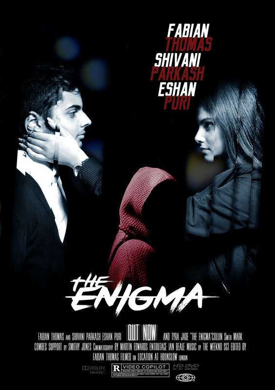
This is the poster which Fabian and Shivani worked on. I think it looks fantastic and generally just looks extremely professional. The antagonist, the Enigma, still intentionally remains anonymous in the poster to create that sense of mystery and suspense. In addition to this, the positioning of the character helps link it to our narrative intentions in that he divides the two protagonists and disrupts their relationship. Noah and Ria are seen here to be split apart, whilst the Enigma stares down at the audience. This coincides with Tzvetan's Todorov's equilibrium theory. The colour scheme of red and white not only has the effect of helping it to stand out on a black background but also that the colour red itself connotes blood,symbolising that something bad is imminent.
